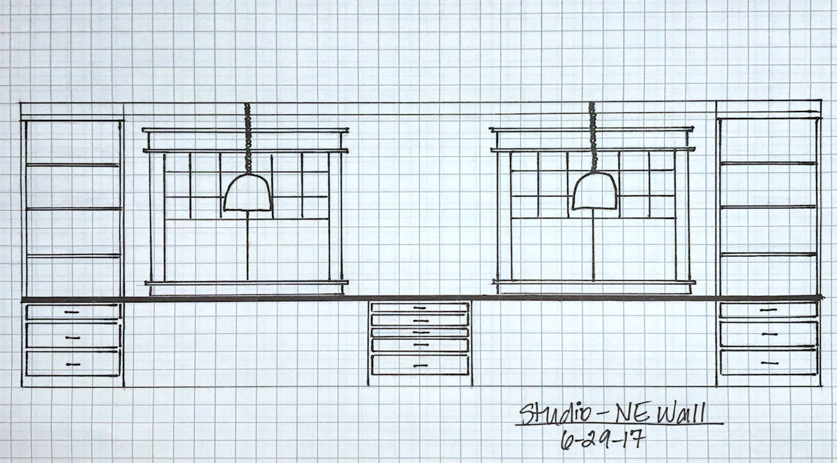
I’m back with another lesson in “it’s okay to change your mind, even in the middle of a huge project.” I change my mind all the time. I allow myself that freedom because (1) this is my house, (2) I need to love my house since we’re in this one for the long haul, and (3) I shouldn’t have to live with things I don’t like if I have the ability and the budget to change them. And those rules don’t just apply to me. They apply to you as well.
This change wasn’t easy to get my mind around because it will completely change the look of the front wall of the studio. And by front wall, I mean the long mural wall. The wall. The focal wall of the entire room.
For years now, I’ve had in my mind what this wall would look like. After all, I did this drawing back in 2017, and I’ve never really considered another look.

That’s a long time to have a plan in place! I did make a change when I decided to eliminate the desk areas and put lower cabinets all the way across that wall. But that didn’t really change the overall look of the wall. But the change that I’m making now will change the overall look.
Yesterday, I put together two of the four upper cabinets for this wall and put them into place.

I had still planned to add 20-inch cabinets on top of those so that the finished cabinets would be the full height of the wall. And these are supposed to be open shelves with no doors.

But the more I looked at this wall, the more I realized that what I’d really like to see is more of the mural. Once I get those cabinets build 20 inches higher, get them all trimmed out, and then get the windows trimmed out, the only significant portion of the mural that will show will be that large center section.

My initial thought was that I could carry the mural onto the back panels of those upper cabinets since they’re going to be open shelves, but my mom talked me out of that. She said that once I get things on the shelves, it would look too busy with the items in front and the big flowers in back. I didn’t want to admit it 😀 , but I know she’s right.
I had to decide what was more important — the upper open shelves or the mural. And quite honestly, I came down on the side of the mural. After all, open shelves can and do look pretty if they’re styled just right. But who wants to keep all of those open shelves pretty and styled in a studio/workroom? I don’t want to have to worry about that! I want to be able to stash things behind closed doors and in drawers, and get on with the fun of creating.
So I’ve decided to do away with the upper open shelves and take the mural all the way across that wall, from end to end. MORE FLOWERS, PLEASE!!! I’ll take more flowers over open shelves any day of the week. 😀
That doesn’t mean that those cabinets will go to waste. In fact, I’m going to order doors for them, and order more cabinets to go with them (since those are only 40 inches high), and put them right here…

The plan from the beginning was to have storage on this wall that’s just inside the room as you’re walking from the breakfast room into the studio. But when I ordered the IKEA cabinets, I couldn’t decide what I wanted here, so I just decided to leave it and address it later. So this is meant to be! These cabinets fit perfectly here, and they’ll be so much more use to me with doors on them so I can store paint and other things behind closed doors.
I think this is going to work out perfectly. I’ll get MORE FLOWERS and more very useful closed door storage. That seems perfect to me. And the great thing is that if I ever decide that I do actually want upper cabinets on that long front wall, I can always add them at a later date. But for now, I’m off to buy two more pieces of that mural so that I can see those flowers spanning the full 20 feet of that wall. 😀

Addicted 2 Decorating is where I share my DIY and decorating journey as I remodel and decorate the 1948 fixer upper that my husband, Matt, and I bought in 2013. Matt has M.S. and is unable to do physical work, so I do the majority of the work on the house by myself. You can learn more about me here.