A couple of days ago, I shared how I’ve reached the point in the studio project where I start to second-guess some decisions. By the end of that post, I had convinced myself to just press forward with my vision, and not make any decisions about changes right now.
On Tuesday evening, my mom came over, and while she was here, I showed her my progress on the studio and we talked through the rest of the plans. One thing that shocked her was how HUGE the office area cabinets were. She hadn’t realized how massive those were just from looking at pictures online, so seeing them in person helped to put them into perspective for her. But as we talked, she also suggested that I press forward and not make any changes to the plan. But then she went home and started reading all of your comments on Tuesday’s post.
Anyway, as she read the comments, she decided to do a mock up of one of the main suggestions that seemed to be repeated in the comments. So yesterday when my mom, brother, and I met for lunch (as we do every Wednesday), she had two printed photos with her — one photo of how the cabinets look now, and one photo with the suggested changes. And then I combined the photos (by doing a little ripping and “pasting” at the table) to come up with a third option.
There seemed to be one standout option that the three of us really liked. But before I start making changes, I want to share the three options with y’all to get your input. This isn’t necessarily a “majority rules” type of thing. This is more the type of decision in which a well-reasoned argument would sway me more than a “majority rules” type of thing. But I’m just curious to see if the crowd favorite at our lunch table yesterday holds its forerunner status in a larger poll.
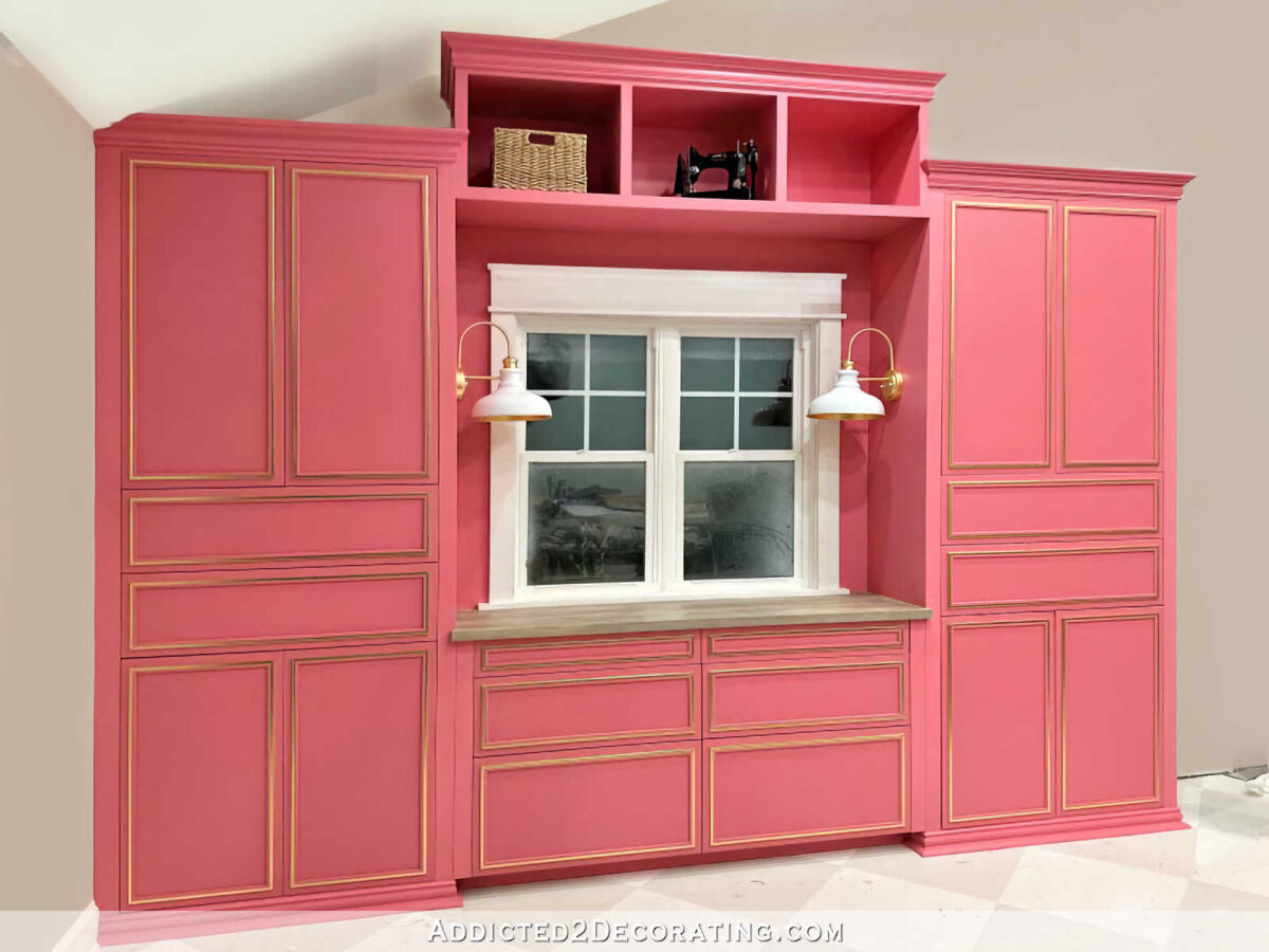
Okay, so here’s Option 1, which is to keep it just as it is right now. (To clear some of the visual confusion, my mom used Photoshop to “paint” the walls and ceiling around the cabinets. 😀 ) So here’s how the cabinets actually look as of this moment. I painted the wall around the window the same color as the cabinets in order to make the whole area look like one cohesive unit.

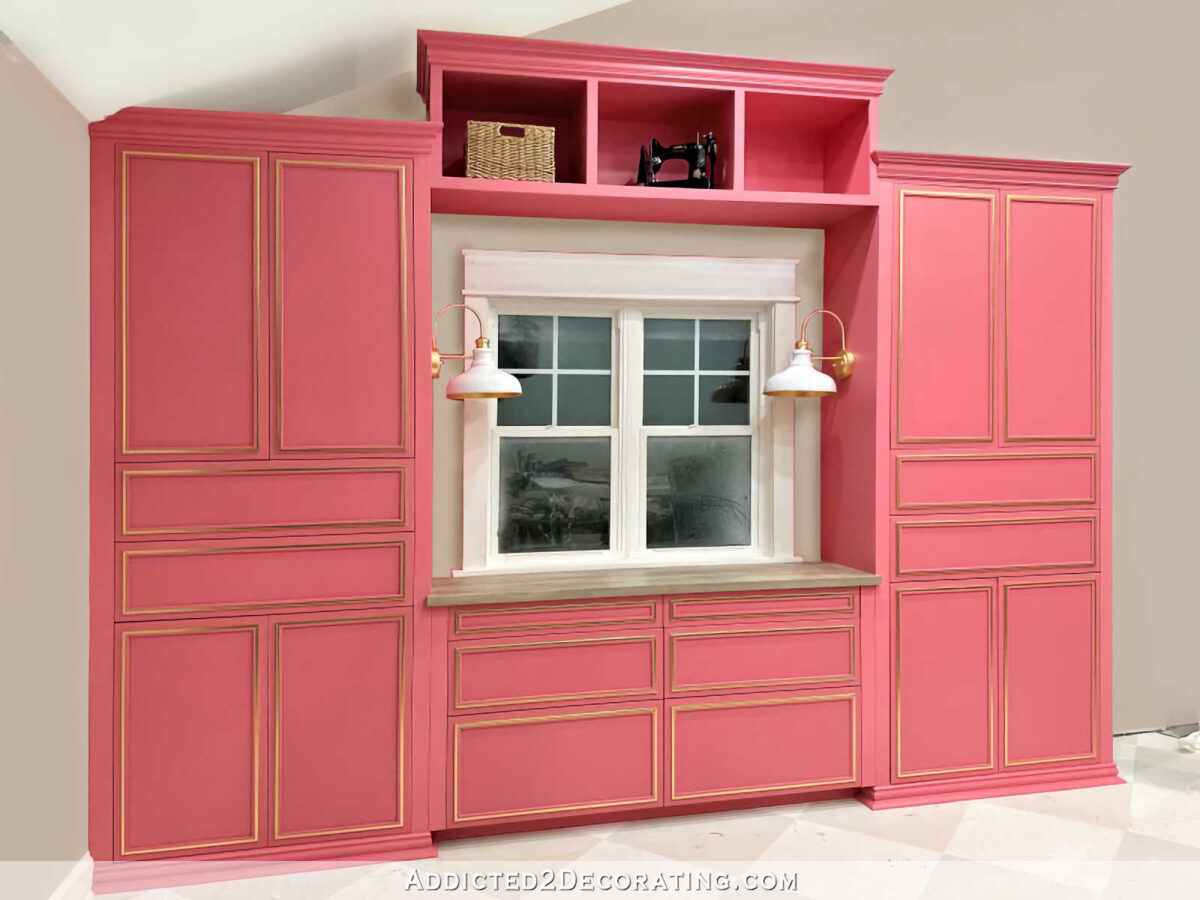
Here’s option 2, with the wall around the window painted the wall color, which is Benjamin Moore Classic Gray. This option keeps the whole bridge the cabinet color so that all of the cabinets, including the bridge, looks like one cohesive unit built around the window with a little bit of wall showing around the window.

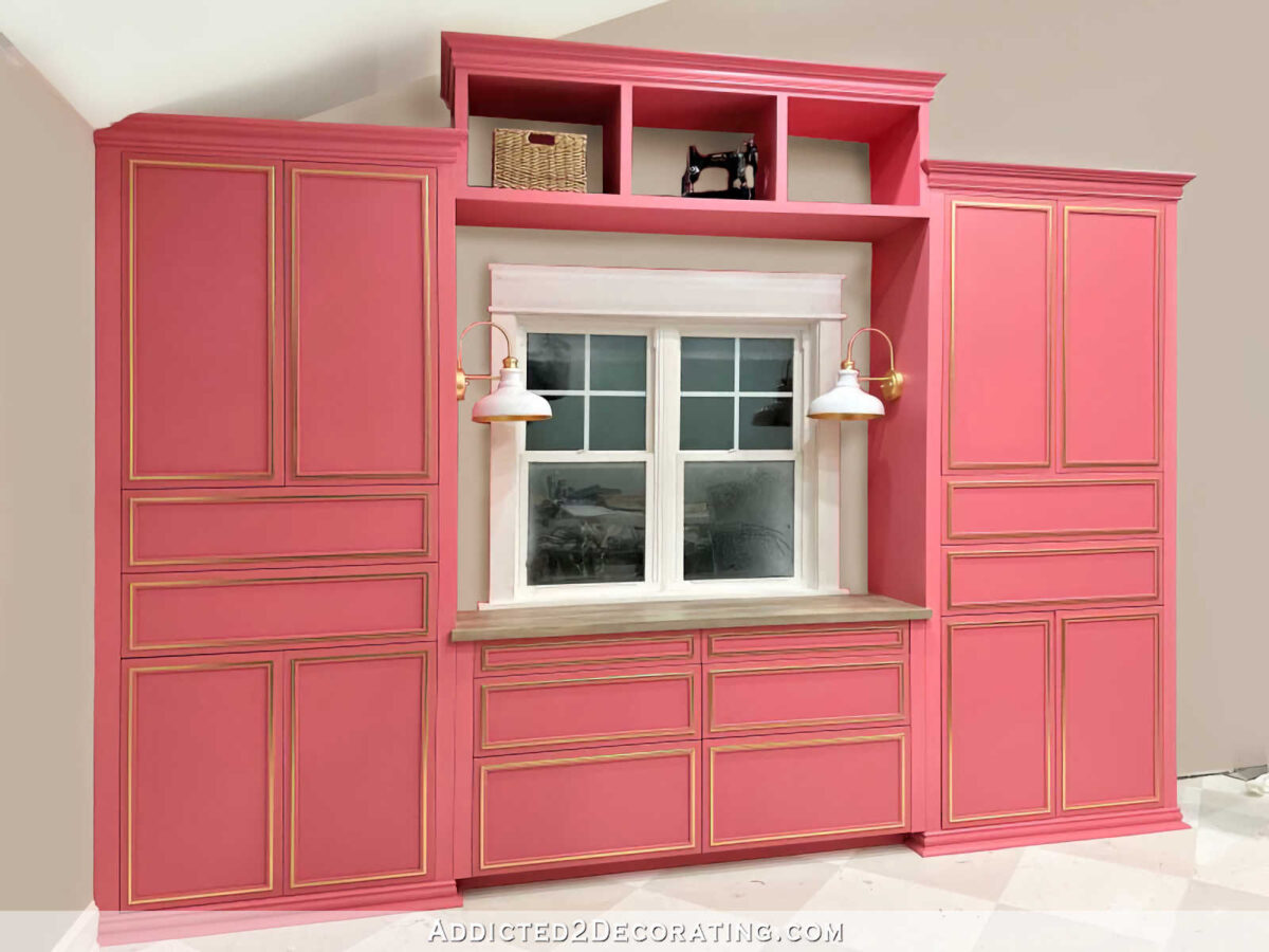
And finally, here’s Option 3, which not only has the wall color around the window, but also had the wall color at the back of the cubby bridge section. This option still has that cohesive look with the majority of the cubby bridge being pink, but also opens up and lightens the look of the bridge by giving the illusion that the back is open (which it’s really not) with the wall showing through (which it really doesn’t).

So those are the three options I’ll consider. I know there were some who suggested using the floral wallpaper mural from the mural wall in those sections around the window and at the backs of the cubbies, but the three of us yesterday agreed that that wouldn’t work because (1) the pattern is simply way too large, and in those small areas, it wouldn’t even be obvious that the pattern is flowers. It would just look like random bits of color, and (2) the pendant light that I’m making to go over my desk is going to be incredibly colorful and large, so I don’t think there’s any need to add more variety of color to the wall behind it.
With that said, just sticking with the three options presented above, tell me your thoughts. Which one stands out the most to you? I’m so curious to see if the table favorite yesterday is the crowd favorite today.

Addicted 2 Decorating is where I share my DIY and decorating journey as I remodel and decorate the 1948 fixer upper that my husband, Matt, and I bought in 2013. Matt has M.S. and is unable to do physical work, so I do the majority of the work on the house by myself. You can learn more about me here.