With the first international break of the year imminent and two major tournaments just beginning to appear on the horizon, Adidas has unveiled a whole raft of the home and away kits that will be worn by their various partner federations at both the 2024 Copa América and European Championship.
There is a common design thread running through all of the kits that have been unveiled across both continental tournaments, with Adidas keen to maintain each nation’s footballing identity while reinvigorating their traditional style with modern tweaks and flourishes.
As such, fresh inspiration has been taken from such wide and varied sources as folk art, South American mountain ranges, flowers, the metaverse and even classic cartoon characters.
Here we’ve sifted through every Adidas kit released ahead of Copa and the Euros that will run alongside it this coming summer, assessed the various wares on offer and also provided ratings for each individual design.
– Stream on ESPN+: LaLiga, Bundesliga, more (U.S.)
Copa América
Argentina home

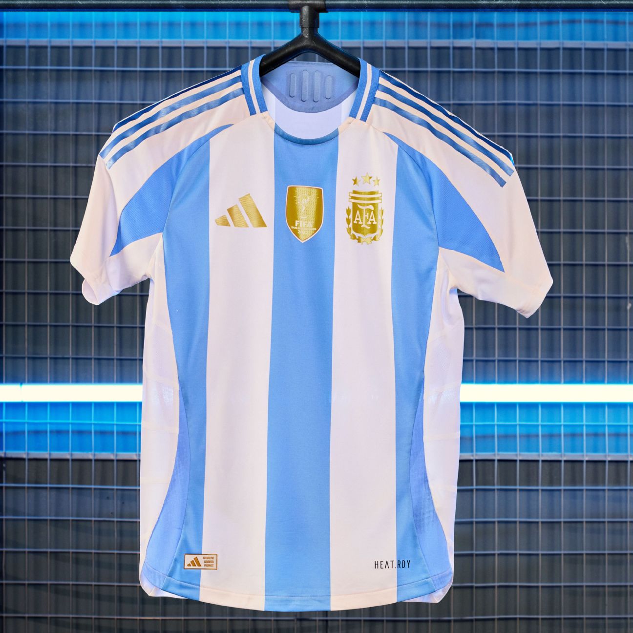
The defending World Cup, Copa América and intercontinental champions are saluted for their international glory in fitting fashion with a jersey of refined, regal golden detail added to elevate their perfect blue-and-white stripes. All the usual badges and shields have been smelt in gold, as has the famous “rising sun” coat of arms which has been affixed like a medallion to the nape of the neck.
Rating: 9/10
Argentina away
In comparison, the Albiceleste‘s away shirt doesn’t quite match up with the only notable decoration found on the plain royal blue jersey being a few glossy swashes of light blue trim and a couple of awkward striped “prongs” rising up from the bottom hem. Not an ugly kit by any stretch but hardly one befitting Lionel Messi and the reigning champs.
Rating: 7/10
Chile home

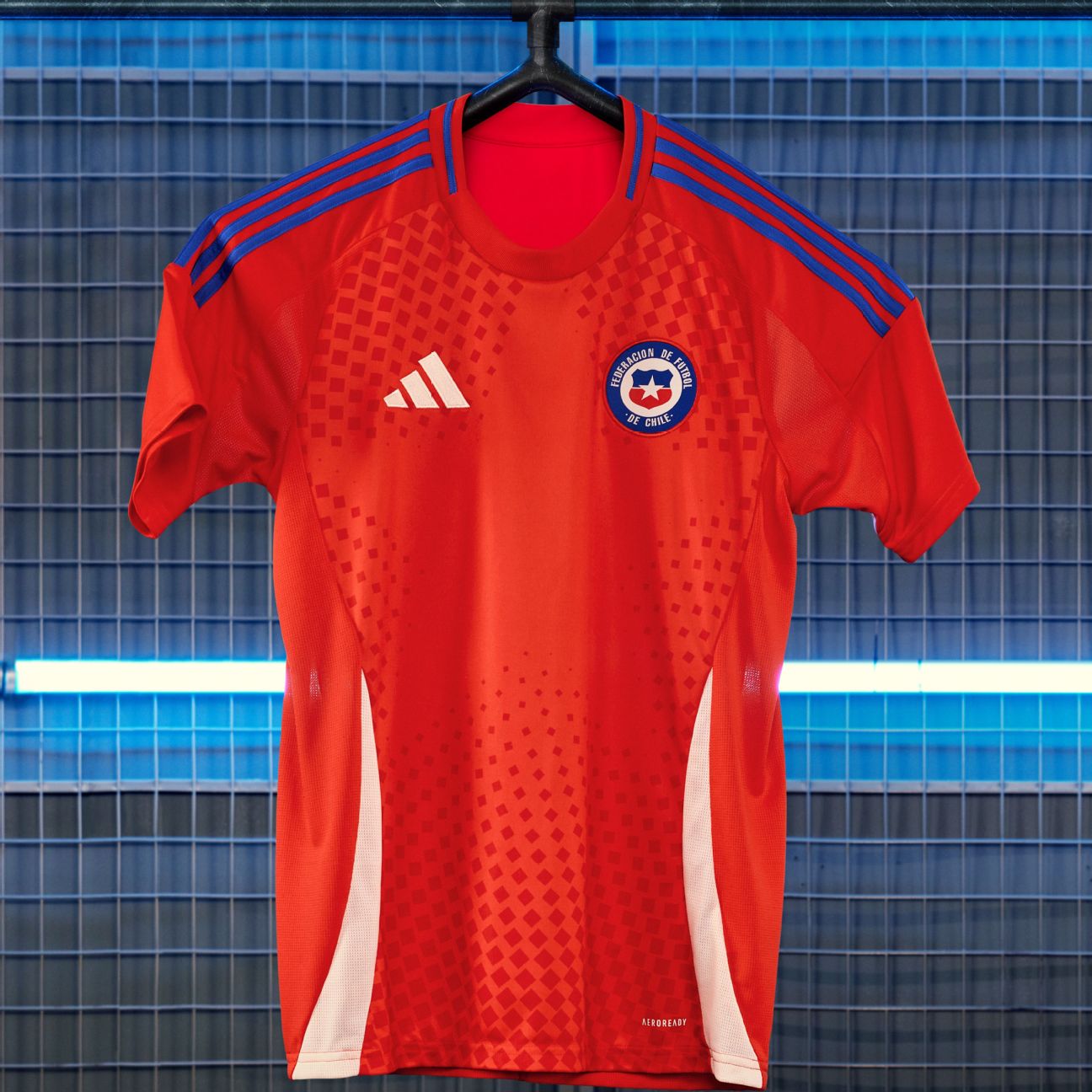
Chile’s home shirt has a loose mosaic of squares cascading over the shoulders that forms a star in the negative space at the centre of the jersey, which is meant to be indicative of the waves of passionate support supplied by the team’s army of vociferous fans, otherwise known as the “Red Tide.” Otherwise, La Roja’s traditional red, blue and white colours look just about as good as they always do.
Rating: 7/10
Chile away
The away kit is supposedly a visual reference to the snow found atop the Andes mountains, which is to say that it’s mainly white with predictable flashes of red and blue trim here and there. Not one that is in any danger of lingering too long in the memory, we suspect.
Rating: 4/10
Colombia home
A simple and straightforward take on the standard Colombia format with a base of vibrant yellow playing host to trim rendered in the other two colours found upon the national flag. The cluster of red blocks on the flanks are meant to resemble the wings of a phoenix as if wrapped around the person wearing the jersey though that is not particularly clear on first viewing.
Rating: 7/10
Colombia away
As is often the case, the Colombia away shirt sees a dark base colour speckled with nothing more than an overlay of monotone trim. It just so happens that the tone in question is an ultra high-vis orange that clashes harshly and begins to trouble the retinas after prolonged exposure. There is also a very subtle smoke effect etched into the fabric as to continue the slightly tenuous phoenix theme.
Rating: 6.5/10
Mexico home
Never shy when it comes to trying something a little different, Mexico’s home kit is an ode to the nation’s long history of folk art with the traditional El Tri palette used to create a stylised depiction of eagle feathers — a symbol found of the nation’s coat of arms — atop a background of deep burgundy red. Brilliant and emblematic in equal measure.
Rating: 9/10
Mexico away
If you thought Mexico’s home kit was good then just wait until you lay eyes on their away shirt, which is again inspired by ancient folk art and in particular the fearsome serpent that can also be found on the national coat of arms. The shirt is a beautiful shade of mint green that is covered in various intricate patterns found adorning the scales of the mythical beast, which in turn lurks on the nape of the neck. A work of art — quite literally.
Rating: 10/10
Peru home
Peru’s home jersey is everything you’d expect it to be with a white base, gold trim and that famous red sash draped from the left shoulder to the right hip just as it has since the 1930s. While difficult to make out, the fabric is also imbued with a wavy, wood-grain design that mimics the texture of the Cajon — a box-shaped Peruvian percussion instrument.
Rating: 7.5/10 (including a bonus 0.5 marks for the sash)
Peru away
The Cajon pattern is much more visible on the Peruvian away kit as it can be found rendered in a vivid purple hue on the sleeves and “prongs” of the otherwise black shirt. The trim is all gold including the slogan Unidos Siempre (Always United) that is stamped on the neckline as a mark of the eternal bond between the team and their fans.
Rating: 6.5/10
Venezuela home
Released in late February, Venezuela’s new Adidas home kit comes in the traditional red wine hue that lends the national team their nickname — La Vinotinto — and is complimented by burnished gold trim. Nothing overly extravagant but classy nonetheless.
Rating: 6/10
Venezuela away
The corresponding away kit is a little more visually striking with the white shirt featuring a large, twisted graphic right across the chest in the colours of the Venezuelan flag, thus infusing it with a sense of national identity and passion.
Rating: 6.5/10
European Championship
Belgium home
An ode to both the 1895 foundation their Royal Belgian Football Association and, oddly, to the repeating patterns found on high-end luxury luggage, the Belgium home kit is a little deeper red in colour than usual and features a tessellating diamond motif that carries the crown of the FA crest. Sleek and stylish.
Rating: 8/10
Belgium away
Crumbs! Surely the first international kit directly inspired by a fictional comic book sleuth, Belgium’s away strip is a celebration of Tintin — the iconic creation of renowned Belgian cartoonist Hergé — whose famous blue sweater, white collar and tan chinos are reflected in the various elements of the Red Devil’s ingenious alternative ensemble.
Rating: 10/10
Germany home
The hosts will look suitably dashing when Euro 2024 kicks off in Munich come June. It’s incredibly rare that Adidas get a Germany shirt wrong and their latest offering is certainly worthy of a place in the grand pantheon with fresh lines and the tricolour of the national flag used to create a smart gradient effect on the shoulders that gives the appearance of flickering embers.
Rating: 9/10
Germany away
Quite against the grain, Germany have been furnished with an exceptionally lively away shirt that blends purple and pink washes together via a spiked, radiant pattern on the torso. In a highly unusual change of pace for Die Mannschaft, the design is somewhat tenuously inspired in part by the “digital world of the metaverse” — though we couldn’t even begin to tell you how.
Rating: 7/10
Hungary home
While it’s supposed to represent a modern revamp of traditional templates, there is nothing remotely new or extraordinary about Hungary’s Euro 2024 home kit. It’s a plain red shirt with standard white trim and the Magyars’ twin federation crests affixed on either breast — much as it always is.
Rating: 4/10
Hungary away
The predictable home kit is joined by an equally predictable away variant that sees the red, white and green colours flipped to create almost the exact same design in reverse. Resolutely traditional fare, for better or worse.
Rating: 4/10
Italy home
After suffering a couple of kit design missteps in the past few years, Italy are back to looking their immaculate best again with a simple. suave design that blends all the classic elements of the Azzurri aesthetic — the blue, the tricolore, the history — with minimum interference.
Rating: 7.5/10
Italy away
The away kit is very much occupying the same classically-styled territory with the standard Italy reverse colour of white accentuated with conventional tricolore trim. Both shirts have a linear motif woven into the fabric which forms the shape of the letter “I” while the slogan L’Italia Chiamo (“Italy has called,” taken from the lyrics of the national anthem) is printed across the back of the collar.
Rating: 7/10
Scotland home
A constant design cue leaned upon many, many times over the years, Scotland will once again be draped in tartan at Euro 2024 — or at least an abstract block pattern inspired by the country’s traditional woven cloth. While not a patch on the tartan masterpiece worn at Euro 1996, the latest iteration is undeniably attractive in its own, modernistic way.
Rating: 7/10
Scotland away
Unfortunately the away kit is a little wishy-washy in both design and execution with a pale blue base partnered with dark purple hashing — again, inspired by tartan — down both sides and little else. The strip is apparently inspired by an “iconic Scotland kit from the 1990s” but for the life of us we can’t work out which one it is supposed to be.
Rating: 6/10
Spain home
Removing blue from the palette altogether, Spain will play in a fairly basic red and yellow home kit that comes infused with the flora and geography of the Iberian nation. The wavy patterning in the material is a reference to the seas that lap the coast while the national flower — the Carnation — is also embroidered on the back of the neck. Other than that, it’s highly reminiscent of several of Spain’s equally plain kits from the late 2000s/early 2010s,which in fairness happened to be a very productive period for La Roja.
Rating: 6/10
Spain away
While the themes are identical, there’s more going on from a visual perspective when it comes to Spain’s away kit while features a mellow, sun-bleached yellow base, contrasting red trim and a pale blue wave graphic on the flanks. The beach vibes are on point and once again the emblematic Carnation adds a floral garnish on the back of the collar.
Rating: 8/10
Wales home

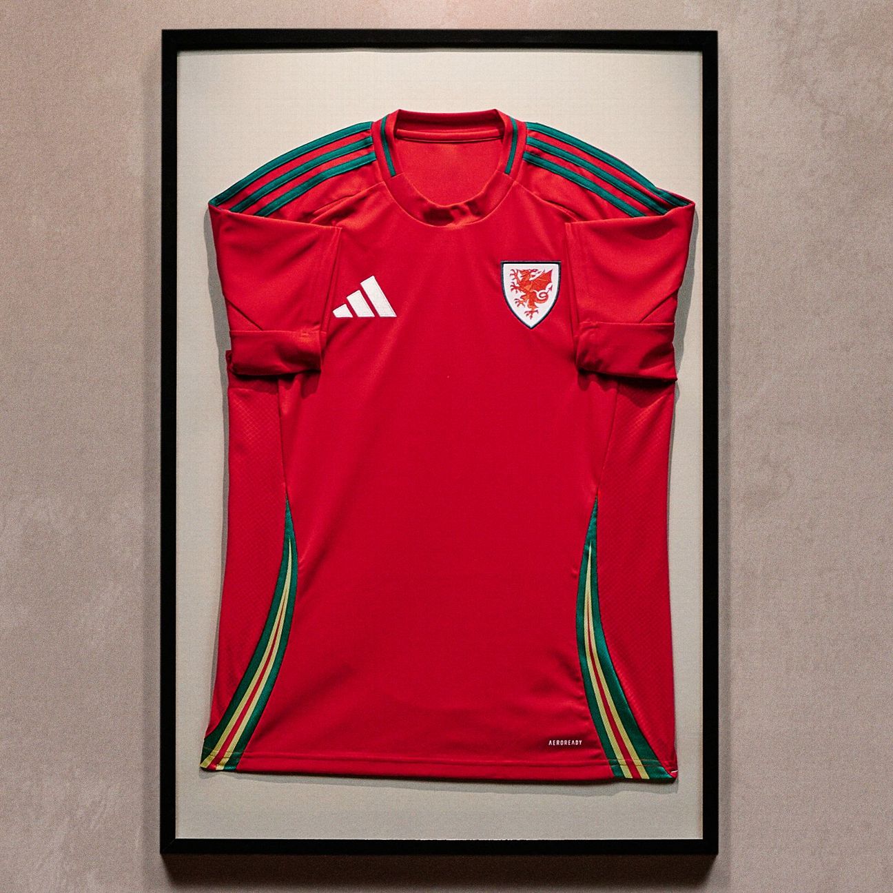
Sparse and to the point, Wales’ home shirt is classic red with green trim and an oversized crest featuring the Ddraig goch (the Dragon of Wales) and nothing else. On the flanks are several “lashes” in green, yellow and red that are inspired by the shape of the dragon’s tail while a daffodil charm can be found on the back of the neck along with the motto “Gorau Chwarae Cyd Chwarae” (“It is better to play together”), the motto of the Welsh FA.
Rating: 6.5/10
Wales away
Wales’ away kit is directly inspired by the retro bucket hats that have become synonymous with their fans in recent years. Sure to be a major hit on the terraces, the shirt is daffodil yellow with a fuzzy red and green zig-zag pattern on the flank panels that echoes the banded design of the aforementioned headwear. Quite possibly has the potential to be an instant classic among the Welsh support. Now all they have to do is qualify from the playoffs to make it to Germany.
Rating: 8.5/10