
It took a few attempts, but I finally got the right paint color for the walls of the back entry of the studio. Earlier this week, I began painting the back entry walls, only to realize that the color that Home Depot had attempted to color match for me (I wanted it to match a color on the studio bathroom wallpaper) was totally off. I mean, the colors weren’t even in the same ballpark. The color they gave me reminded me of pea soup, and that’s not really something I want painted on my walls. 😀
So I took the paint back and tried again. And again, the color match failed. The second attempt was too dark and still too yellow.
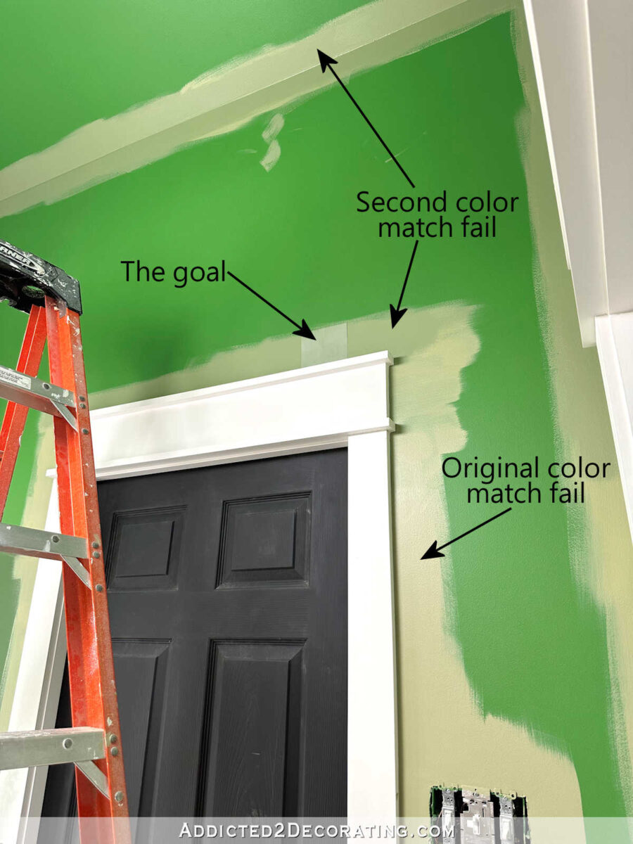
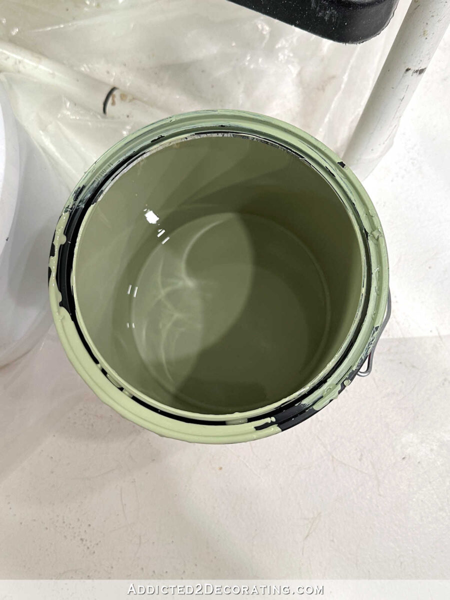
I knew the second color wasn’t right, but the woman had already worked on it for about an hour (helping me while dealing with other customers), and I just couldn’t stand there any longer and watch failed attempt after failed attempt. So I just made sure that I left the store with a color I could work with as a base for mixing my own custom color. Here’s what that second color match attempt looked like in the paint can.
I knew immediately what it needed to get the color right. First, the paint color was too dark. How do you lighten up a paint color that’s too dark? Add white! So after emptying the gallon of paint into a new 2-gallon container, I used the only pure white paint that I had, which was Behr Ultra Pure White ceiling paint. I wanted it lightened up considerably, so I added quite a bit. I didn’t measure it, though. If I had to guess, I’d say I added at least a pint of white to the gallon of green, but it could have been more.
The second problem with the paint color was that it was too yellow. It needed to be more on the blue side. So I rummaged through my paint stash and found the deepest, darkest blue I had on hand (because adding a light blue would require much more paint, and there would be no guarantee that a light blue would get the color where I wanted it).
Well, I didn’t really have any dark blue on hand, but I figured since I was mixing it into an existing green paint color, adding a blue-green color would work just fine. So I pulled out this Behr Beta Fish color, which has quite a bit of blue in it.
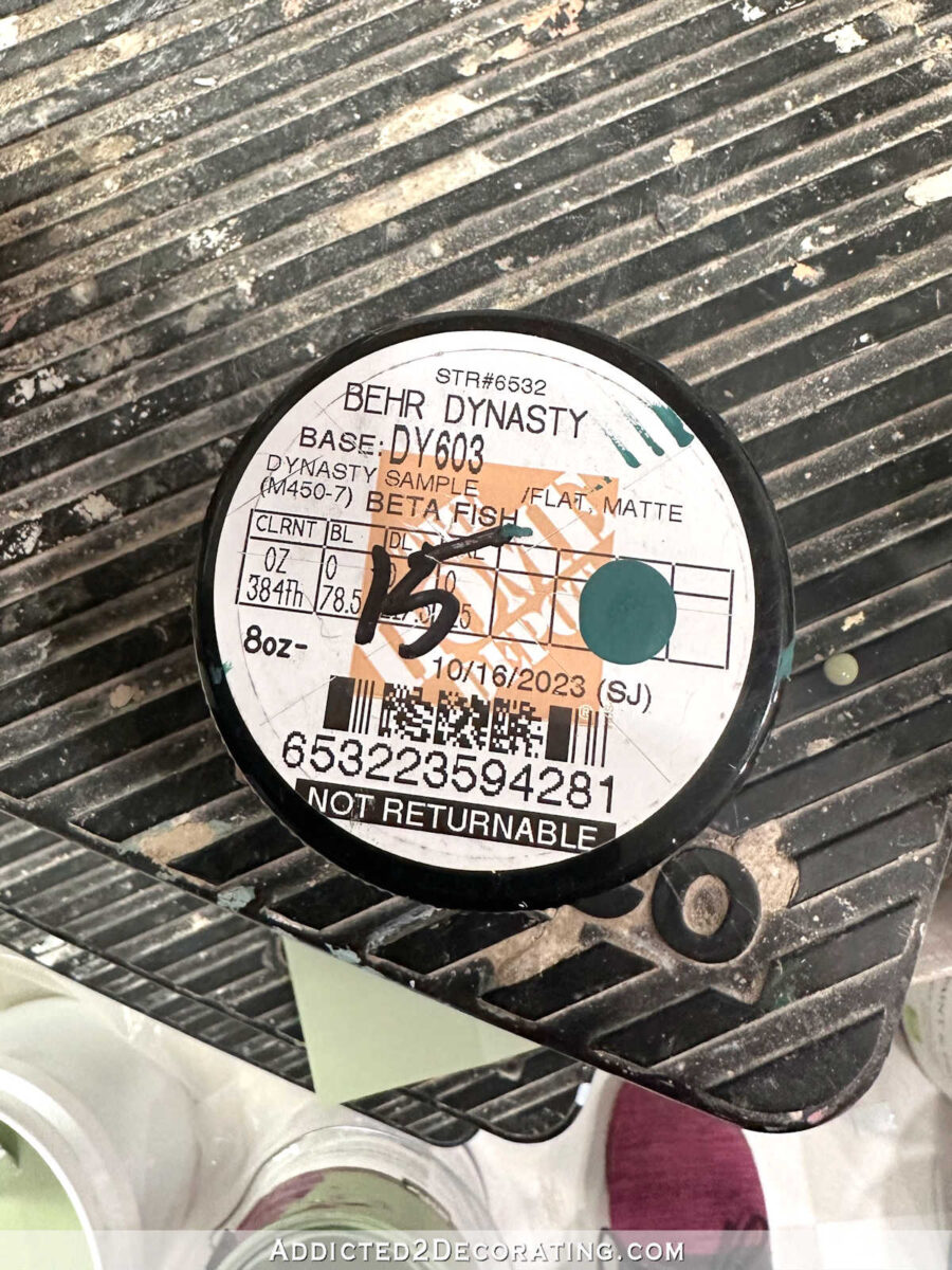
Here’s what the actual paint looked like…
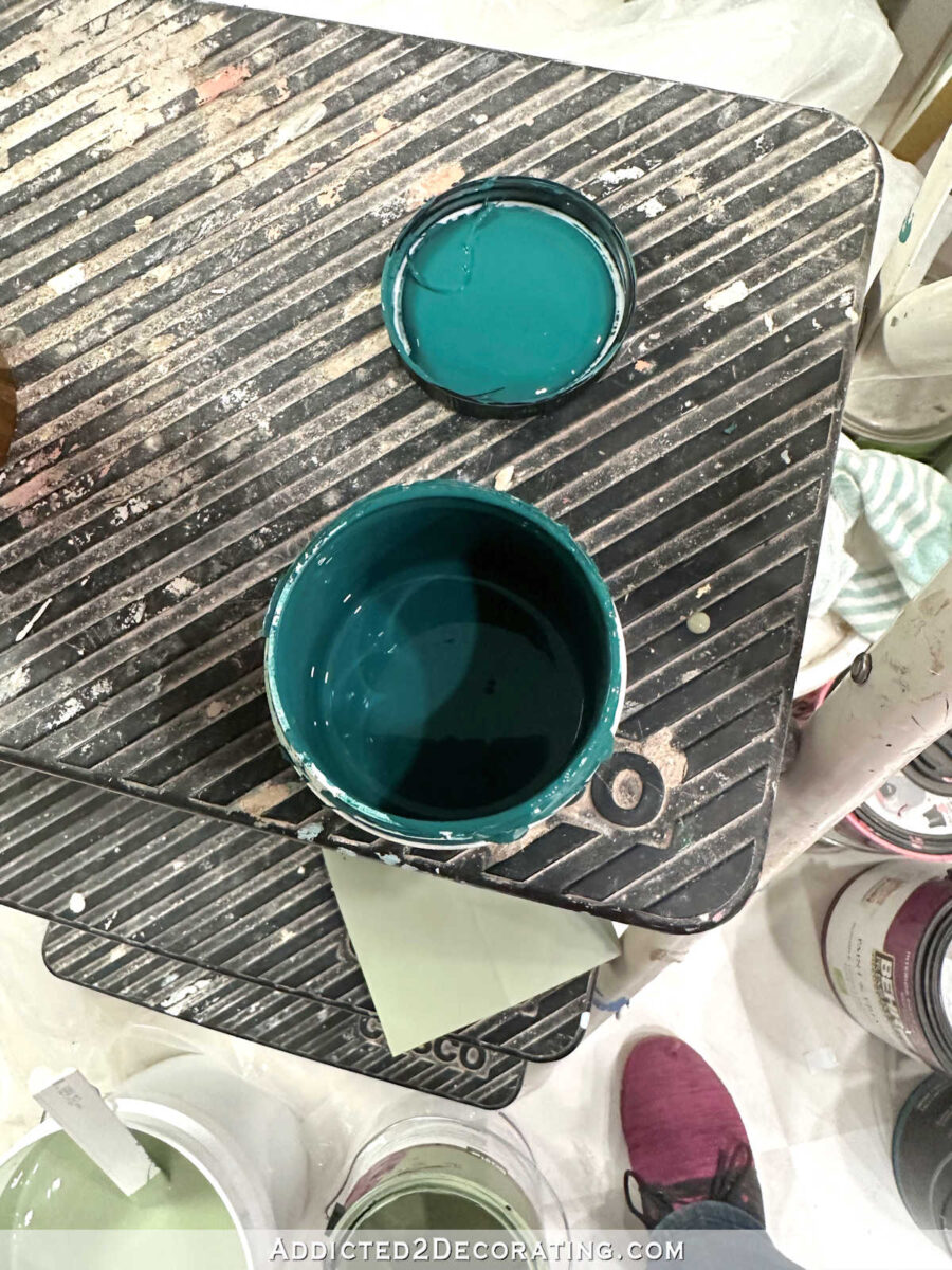
I added the entire sample container of Beta Fish into the color mix and stirred thoroughly, and then tested the color against the wallpaper sample.
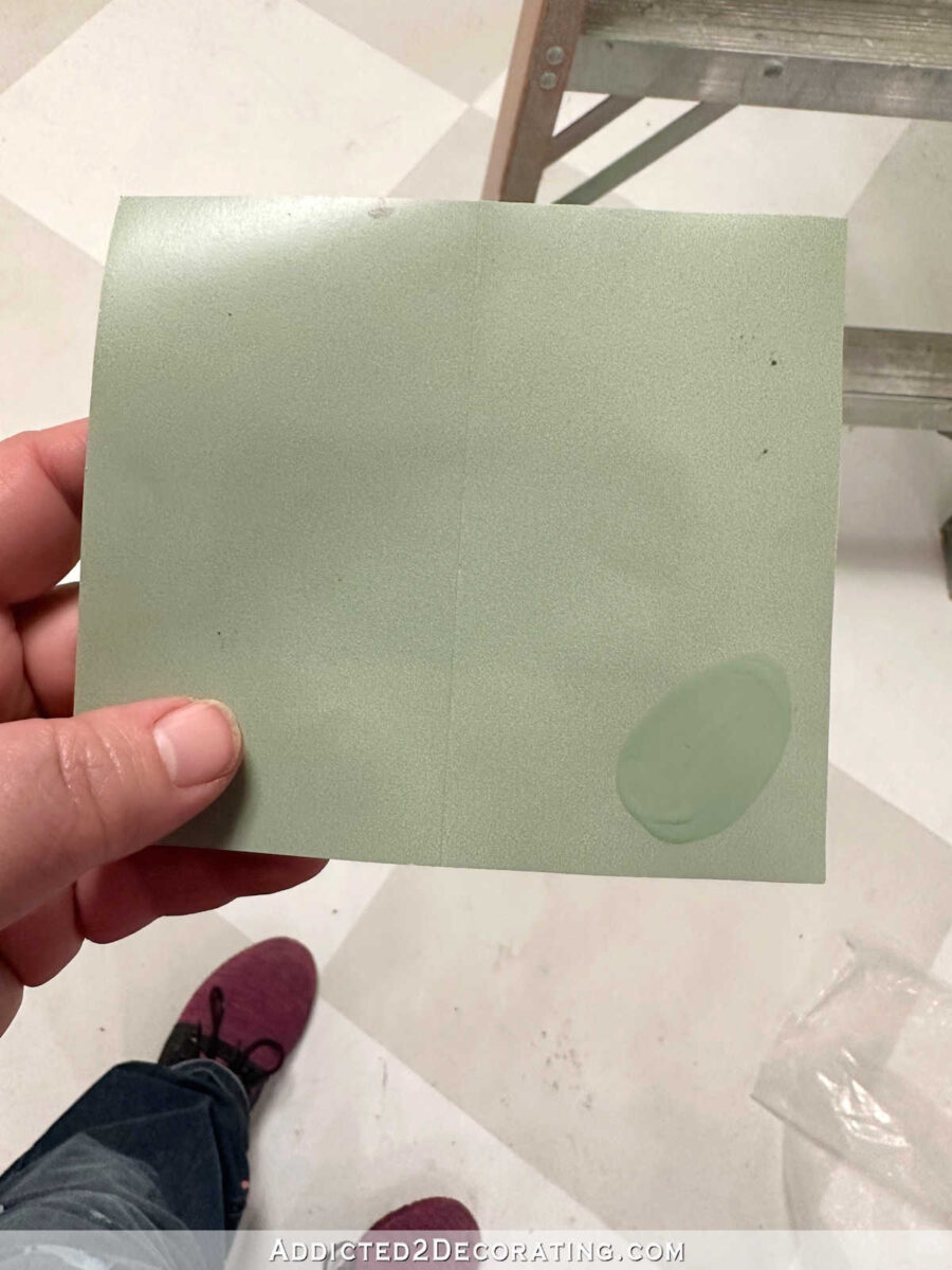
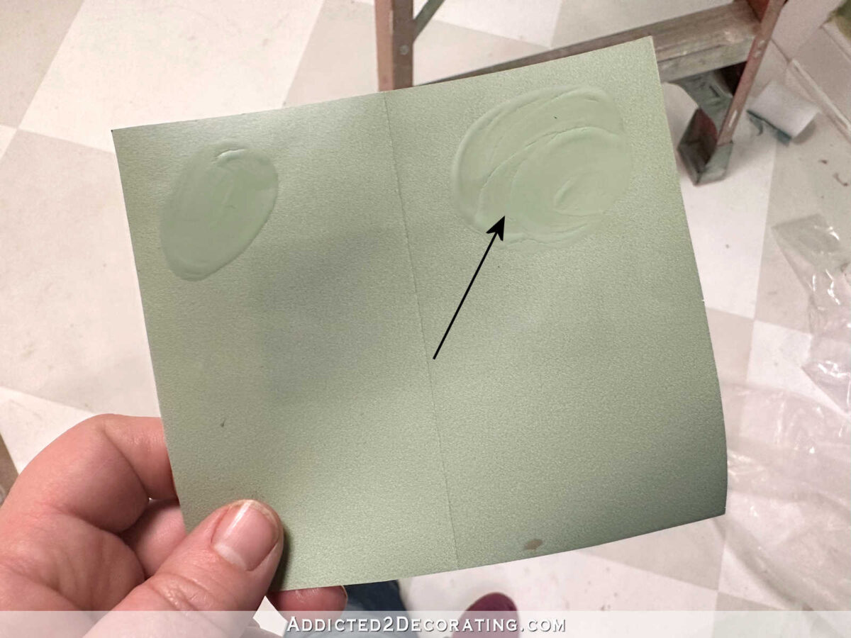
My first attempt wasn’t bad at all. At least it was in the same color family, but the overall color was still too dark. So I added more white (maybe another pint, maybe more) to lighten it up even more. My second attempt was pretty spot on.
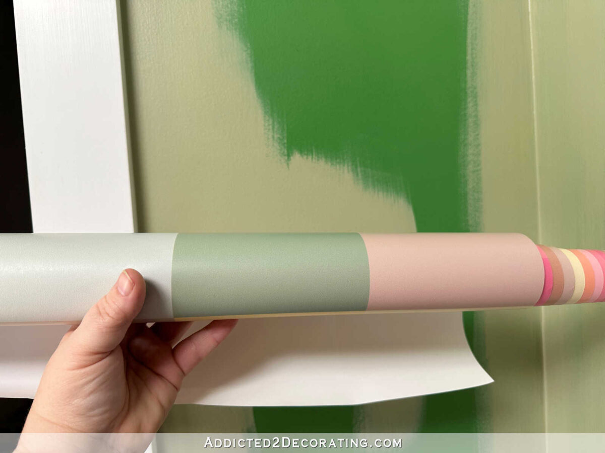
I decided to go for it. It may not have been exactly perfect, but it was close enough for me. You can see all three colors — the original color match attempt, the second color match attempt, and my custom color mix — in the photo below. See how the final color just has a brightness to it that the other two lacked? That’s not only because I lightened it with white, but that’s the result of eliminating some of that yellow in the previous two attempts. I’m just not a fan of yellowish greens, which shouldn’t be a surprise given my love of teals.
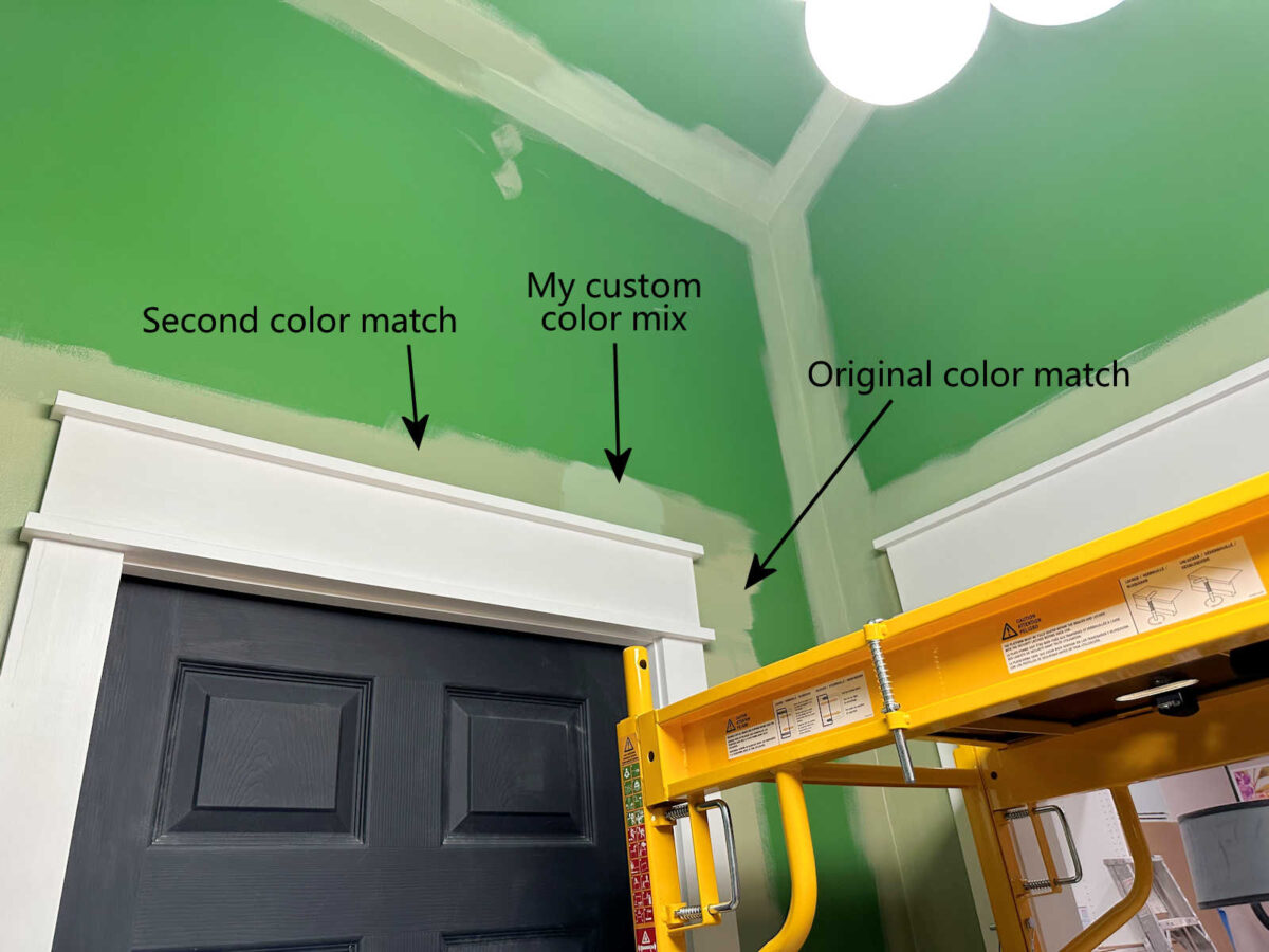
And here’s another look at the three colors together. You can see just how vastly different the original color match attempt is from the final paint color that I mixed myself.

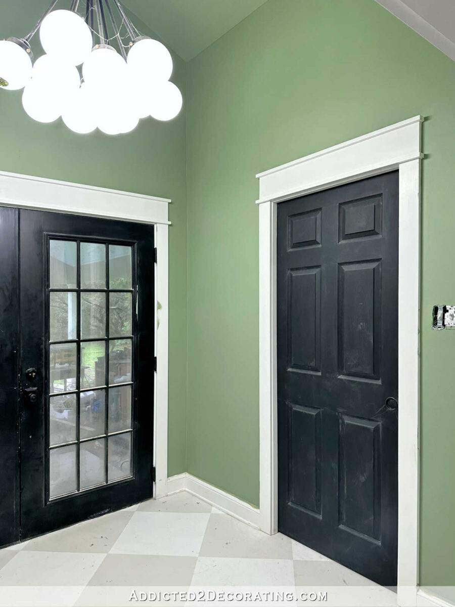
So here is the final color on the finished back entry walls. I know that blue color on the walls and ceiling in the foreground is a little distracting. 😀 Now that I have my own scaffolding, I’m anxious to finish all of the painting in the main part of the studio, so the remaining areas of blue walls and ceiling won’t be around much longer. But hopefully you can look past that and just focus on the green back entry walls.

I think this color is so pretty, especially after living with that in-your-face Kelly green for so long. That Kelly green/back combo just started to look so harsh to me.

This softer, more muted green complements my studio cabinet color so nicely. It adds color to the back entry without competing with the bright, fun cabinet color or the colorful mural.

And of course, I’ll eventually be making curtains for this area using the same colorful floral print that is on the mural wall. So these soft green walls will really let that fabric sing.

And I also like the view from the entrance to the room. The green on the walls


Addicted 2 Decorating is where I share my DIY and decorating journey as I remodel and decorate the 1948 fixer upper that my husband, Matt, and I bought in 2013. Matt has M.S. and is unable to do physical work, so I do the majority of the work on the house by myself. You can learn more about me here.